How to use Switch in Thunkable | Designer and Blocks Clear Explanation
Hello friends, welcome to the another tutorial of Thunkable. In this tutorial, we will know about Switch , it's uses and how to use it.
Switch
Introduction
Switch is a input element (which takes action from user and responds to it), just like a checkbox. It accepts user input, and return true, when it is selected, otherwise false. We can also associate a function to it, which fires everytime, when it is turned on or off. We can use this function to do something for our needs.Uses
It is used, where we had to ask any question from user, and the only answers to it can be either Yes or No. for e.g. In a true false app, or to turn on some particular settings, turn on wifi etc. as shown in below image.How to use
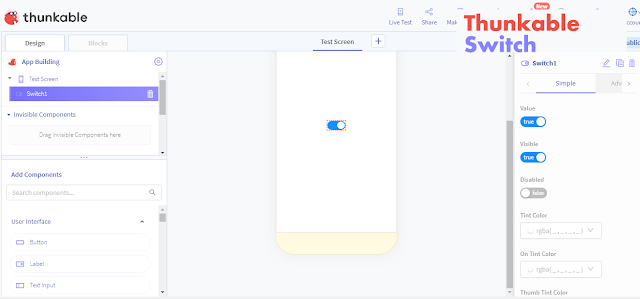
We can simple drag and drop it on the screen in Thunkable. After that we can customize it's design according to our needs, from the options available in Designer section.Designer
- First thing, that we had to do, is to rename the Switch. This provides Switch a unique name, which will help us in writing blocks easily, by easily identifying, which Switch is added for which function.
- Value - If sets to true, the Switch will be turned on by default.
- Visible - If sets to true, the Switch will be visible to the user.
- Disabled - If sets to true, the Switch will be disabled i.e. It doesn't accepts any user input.
- Tint Color - It sets the color of Switch track, when the Switch is turned off. It accepts value in rgba() or Hex Color Code value.
- On Tint Color - It sets the color of Switch track, when the Switch is turned on. It accepts value in rgba() or Hex Color Code value.
- Thumb Tint Color - It sets the color of the Switch thumb i.e the circle which moves in Switch. It accepts color in rgba() or Hex Color Code value.
Blocks
It is used to add functions to the Switch. We can also customize the properties, that is used in Designer section. The property which is customized using Blocks will be applied i.e If we turned on switch by default in Designer section, and turned off in Blocks section, then the Switch will be turned off by default.- when "Switch" "on Value Change" - It fires everytime, when the switch is either turned on or off. It returns true, when the switch is turned on, otherwise false in New Value block. we can use this New Value along with Logic & Control blocks, to do some function as shown below.
- from "Switch" set "Value" to - It turns on off the Switch. If we sets it's value to true, then the Switch will be turned on, otherwise turned off.
- from "Switch" get "Value" - It returns true, when the Switch is currently on, otherwise false.
- from "Switch" set "Visible" to - It sets the visibility of Switch. If sets to true, the Switch will be visible, otherwise not.
- from "Switch" get "Visible" - It returns true, when the Switch is currently visible, otherwise false.
- from "Switch" set "disabled" to - If sets to true, it will disable the Switch.
- from "Switch" get "disabled" - It returns true, if the Switch is currently disabled, otherwise false.
- from "Switch" set "tint color" to - It sets the color of Switch track, when it is turned off. We can use Color blocks along with it to change color.
- from "Switch" get "tint color" - It returns the current tint color of Switch.
- from "Switch" set "on tint color" to - It sets the color of Switch track, when it is turned on.
- from "Switch" get "on tint color" - It returns the current on tint color of Switch.
- from "Switch" set "thumb tint color" to - It sets the color of Switch thumb.
- from "Switch" get "thumb tint color" - It returns the color of thumb tint color.
Thanks,


Comments
Post a Comment